Identity Development & Café Design
March 6, 2021 In Huddlers Blog Leave a comment

March 6, 2021 In Huddlers Blog Leave a comment
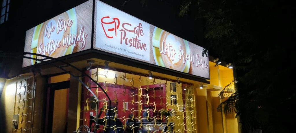
Project : Café Positive Identity and Café Design
Brief
Cafe Positive is an initiative that enables HIV+ve youth and orphans to be self sustained and to start a positive conversation about this cause amongst the larger community. It was started by OFFER, a nonprofit organisation that works on care and protection of children & youth in need.
We undertook the task to develop the visual identity of Café Positive and create a brand compliant design for the Café. The café was relocating from Jodhpur Park to a new space at Lake View Road. The new café design had to be done from ground up.
Challenges
To translate the brands characteristics onto the café ambience was crucial, to appear attractive and also be associated with a meaningful purpose. There was a very limited budget within which we had to complete everything.
Methodology
We first looked at the previous visual identity and decided to give the logo unit a more modern look and feel. The previous logo unit had many challenges from flow of readability to being adaptable on all formats.
Hence we retained the primary colour palette and made a simpler and fresher logo unit, retaining it’s original essence and using a font style that was more casual, appeared friendly and approachable.
Elements
Once the visual identity was ready, we had to create brand assets like the website and update the social media presence.
Yellow being one of the primary colour, which signifies vibrancy and joy was an essential visual driver to make branded communication appear attractive and youthful.
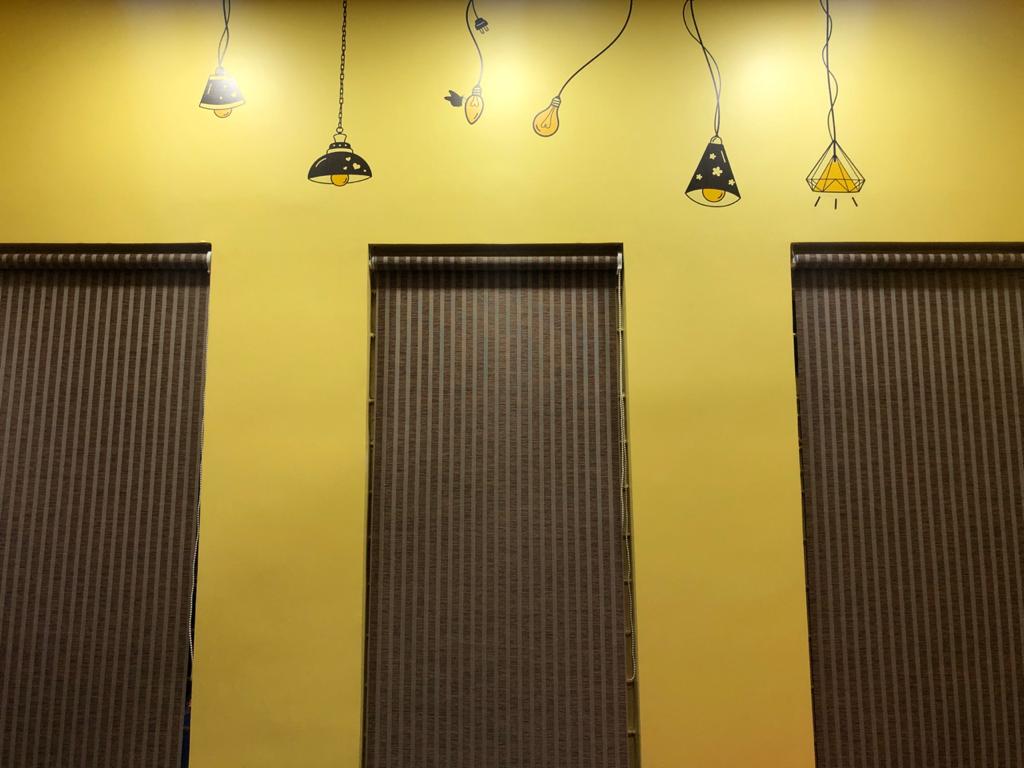
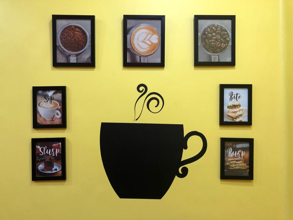
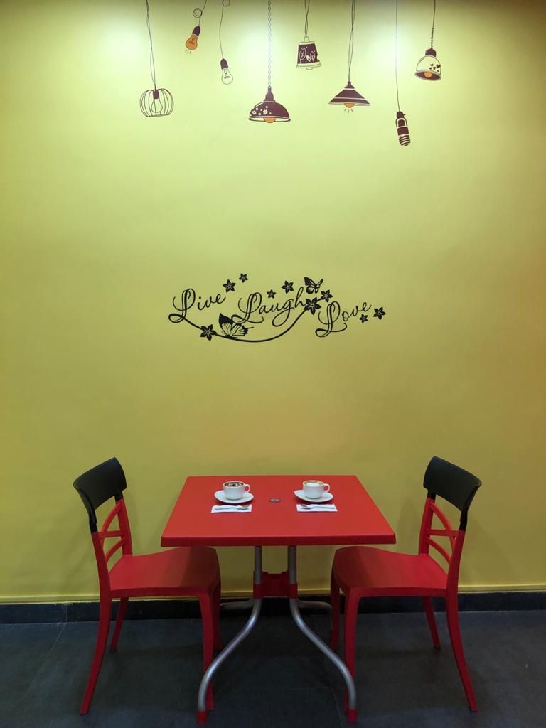
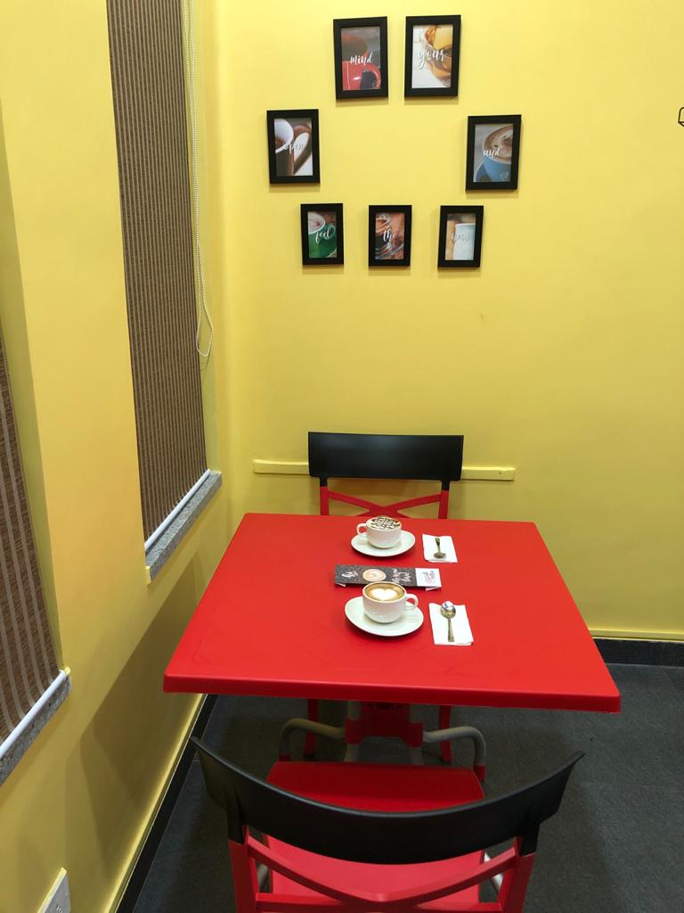
We choose to create a clean and minimal designed website, and as for the physical space, we used the brand colour palette to create a joyful, inviting and vibrant ambience.
Simplicity was the key towards making the space have it’s unique spark and yet stay economical.
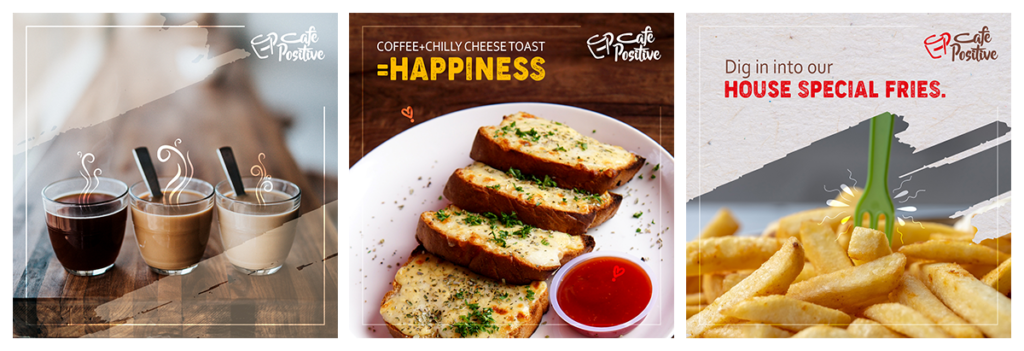
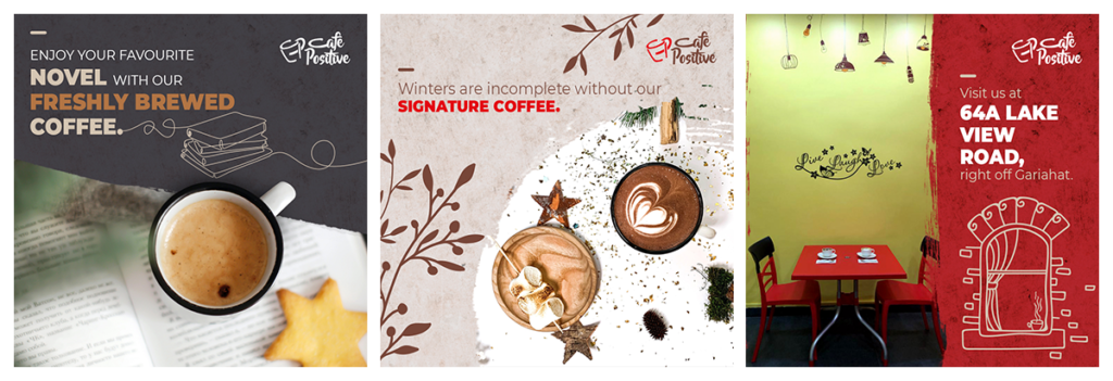
On social media platforms, focus was on showcasing the sumptuous and delectable menu to create awareness of the available items that can be ordered at the physical café, to increase footfalls at the store. The vibrancy of the physical store is incorporated in all of the social media communication to maintain consistency in the look and feel of the brand.
Visit the social media page by clicking here
What we felt about the project:
Sociability is one of human being’s lives cause and effect, and since Huddlers was responsible for creating Café Positive’s imagery starting from its logo unit to physical and digital presence, we have been lucky to see how Café Positive has been indeed changing lives and creating an atmosphere where more youngsters are willing to be participants of bringing forward a change in the way HIV +ve individuals are being looked at. It indeed lifts our spirit and gives our work life meaning, when we find our work contributing in some small way towards such a positive change.